Right after Tiger arrived on my doorstep, I went shopping for a firewire harddrive. I waded through a ton of reviews and finally settled on an OtherWorld Computing Mercury harddrive. So far it’s working very well. Although I could have used the included Retrospect program, I opted to go with a shareware program named SuperDuper!. And that was probably one of the better choices in software I’ve made. As soon as I used it, I knew it was worth every penny of the shareware price (which I immediately paid). Sometimes, I look at a piece of software and have a debate about whether the fee is worth it, whether there might not be something out there that’s freeware or open source, whether I’d rather just use something that’s produced by one of those big software companies…but there was no debate about this one. I fired up this app and just knew.
via Ms. Cranky Pants Techie Geeky Mac Stuff (Thanks, Alice!)
Just noticed this:
Painless disk cloning - Just a quick plug for SuperDuper which may end up joining DiskWarrior as my must-have Mac utility. It does exactly two things very well: a) it creates bootable DMG clones of Mac disks and b) it lets you very easily update the disk images using boilerplate or customized scripts. Part 1 has historically been the domain of Carbon Copy Cloner — a great little app. One thing SuperDuper adds is a simple interface for scripting the items/folders you do and don’t want to clone as well as how you want them to behave (new vs. changed, etc.). This basically means you now have a perfect copy of your drive that can be restored very easily in case of calamity. Ditto for doing a “safety clone” before you install a bunch of dicey system upgrades. Highly recommended utility.
via 43 Folders: Thanks, Merlin! (and don’t miss Merlin’s classic 5ives, either!)
Summer’s Cauldron Tuesday, September 06, 2005
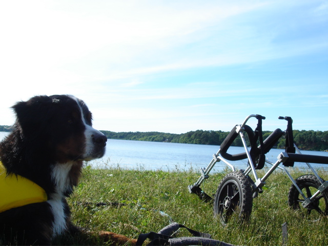
Well, summer’s almost over, and I haven’t done a Ketzl update for a while. So, here’s perhaps more than you wanted to know. (As with previous posts of this nature, I hope the details involved help others who might find themselves in a similar situation.)
K’s disease progresses. We slow the inevitable with exercise, physical therapy, drugs, harnesses, wheelchairs: whatever we can.
In fact, if you’re wondering why Shirt Pocket technical support is slower than usual on some afternoons, it’s usually because I’m down in Walpole, MA at Sterling Impression. There, Ketzl gets massage, electro-stimulation, and hydrotherapy from the fine people there. It takes a few hours out of the middle of my day once a week, but I feel it’s time well spent.
Up until a few months ago, Ketzl was able to use their water treadmill. Alas, her rear legs are no longer under any kind of conscious control, and are almost entirely atrophied: bones covered with a teeny bit of muscle and tendon where there used to be large, strong, cart-pulling tree trunks. So, she now does laps in the therapy pool (22 last week—she was rarin’ to go), wearing a life preserver to improve her buoyancy.
After the swim, it takes me nearly an hour to dry her completely, which is important since she spends so much of her time lying down: you don’t want her to remain wet, as it tends to lead to hot spots.
Although her front limbs continue to weaken, she’s still able to support herself, and we use her wheelchair to walk every day at 80 Acres—some conservation land near my house. There’s a pond there, and it’s always a bit of a challenge to prevent her swimming—which (despite the momentary delight) would involve hours of drying. Her frustration is palpable, but I try to alleviate it with a cookie or two: an effective tactic!
Ketzl is, at this point, almost entirely incontinent, but it’s much easier to deal with than I had feared. Her patterns are regular and relatively easy to anticipate—and if we do things right, she goes outside when and where she’s supposed to.
When she’s in the house, we place her on an absorbant “diaper pad”, just in case there’s an accident. While they’re rare, they do happen—and this makes them very easy to clean up.
Part of the reason this hasn’t been a huge problem is due to a condition called “neuro bladder”. Basically, the muscles around the bladder atrophy along with everything else, and the bladder itself expands. The result is that she can hold an awful lot of urine before she needs to go—too much, in fact, so it’s important that we take her out often during the day.
The muscle wasting means we must assist her, which involves helping to position her rear legs, moving her tail out of the way, and putting light pressure on the bladder to help it empty. Doing this while also holding her back end up is a challenge, but Zabeth and I have managed to get pretty good at it over the past few months, and Ketzl has been very tolerant as we’ve figured out the best ways to help her.
Probably the most difficult part has been nighttime, as we’ve always let Ketzl sleep on our bed. Dogs with diseases like this tend to get a kind of separation anxiety at night, Ketzl included, and sleep erratically, occasionally whining or panting for an hour at a time. It’s not conducive to sleep, and I don’t think I’ve managed to get more than about two hours of continuous rest for many months. Recently, we’ve been giving her a light tranquilizer at bedtime, and it’s helped quite a bit—but if you see me around and it looks like I haven’t slept in weeks… well, basically, I haven’t. 
So, there you go! Details aside, she’s doing really well. Dogs love “routine”, and there are a lot of routines involved in her daily care. She’s alert and in excellent spirits, with no noted depression or mood changes… in other words, she’s still Ketzl.
And while that’s a great thing, it’s also part of what makes this so incredibly difficult.
Hey, so it’s been a while since I’ve written specifically about SuperDuper! v2.0. And it’s not because I’ve got nothing to say.
So, let’s do a bit of a status update, and another sneak peek.
Where We Are Now
As you might expect, we get asked when SuperDuper! v2.0 is going to ship all the time.
I know you want the new version: I want to give it to you! But, it’s not ready. We’re close, but we’re not done: there’s one significant thing left to do, and it’s a bit more difficult than we anticipated. We want to get it right—as we always do—so, it’s taking a little time.
But, once that’s complete, we’ve got a bit of polishing left, and we’re done. I don’t know how long it’s going to take. We’re going as fast as we can.
So, How’s it Look?
Actually, it’s looking great. Every part of SuperDuper! v2.0 has been improved, from the main window to Options, from the log to status… the copying is better… really, it’s all good.
You Mean, You’ll Never Have to Update it Ever Again?
Yeah. Right.
Well, C’mon—How About Some Screen Shots?
Coming right up!
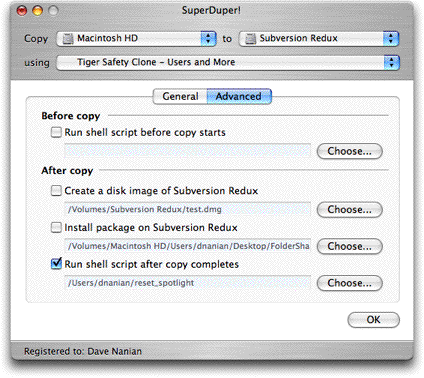
In the new version we’ve broken out the v1.x options into two sets: General and Advanced. This emphasizes the common options—such as the During copy method—while putting more advanced ones—like custom shell scripts, package install and post-copy imaging—into its own tab.
You can also see that we’ve taken our What’s going to happen? approach a bit further, and explain the During copy option you’ve selected right under it (as well as in the main text).

You might also notice the pop-up in On successful completion. In there, we’ve got many more options for what happens after the copy completes, including the ability to shut down the computer, put it to sleep, simply set the destination as the startup volume, etc.
And then, in the Advanced tab, much geekier things that most users don’t need.
We’ve added an additional Before copy option to run a script—this allows people to do cool things like dump MySQL databases before backing up and do other “before you touch things” operations, and renamed things a bit to make their purpose clearer.
So, we ended up with:
So—there you go… and yes, everything we’ve posted about so far works, and works well.
Back to the grind!
When I left Windows for the Macintosh years ago, there was one thing I didn’t count on: there are no good personal finance programs available for the Mac.
Yes, there’s Quicken 200x, and I tried it for six months (and have looked carefully at every version when released, including the latest minimum-changes-required 2006). But, it’s a pale reflection of its PC version, and is kind of old and clunky to boot: it clearly has “OS9 port” and “1998 feature set” written all over it. Which is too bad—Mac users deserve better.
Now, it’s very possible to do a good job with a program that was originally written for OS9: see BBEdit, for example. (Hi, Rich!) And while I’m a big Cocoa fan, Carbon isn’t the problem—there are plenty of ugly, clunky Cocoa applications. The problem is that Quicken is old and under-featured, especially when compared to similar applications on Windows.
So, I’m stuck with a boat anchor: Microsoft Money.
For years (1985-1999 or so) I used Quicken, starting with Quicken for DOS (I was actually one of the testers, way back, and I’m even in the manual for one of those old versions). But, around 1999, Microsoft got serious about making Money decent, while, at the same time, Intuit lost its way. When my Quicken database got corrupted one time too many, I jumped ship.
Money’s actually a pretty darn good program, and while I have various quibbles with some of the recent choices they’ve made—it’s pretty clear that much of their charter is to drive people to the MSN Money site, and the designers have never tried to use Money on a computer with a less than 1024x780 screen (they’ve surrounded everything in the last two versions with so much blank & wasted space it’s driving me insane)—I’ve been happy with it. Its investing tools work well (the portfolio view is excellent), the bill functionality is good, as is budgeting and the various other things I do. And, the Small Business Edition does a reasonable job of printing invoices and the like when I need to do that.
Its only problem: it’s not available for the Mac. So, I keep a PC around (at present, a Motion Computing LS800 Tablet PC), to check out what’s going on in that world (I’ve always been interested in Pen-based computers), and to keep Money running.
(Of course, I can’t just run Money. This is Windows: I also need a huge fleet of anti-virus, firewall, anti-spyware and other programs. Whee.)
So you gotta do what you gotta do: the ship sails on, dragging its anchor behind it. But, mostly, it’s a good ship, Macintosh.
Blame the Weather Saturday, August 20, 2005
The Pavlov’s Beep post got me thinking a bit about how user expectations can set a product up for failure out of the gate… and that made me think of the late, lamented (by some), lambasted (by many) Newton.
Ignoring the obvious hype surrounding the rollout—something the product could never live up to—one of the things that was coolest about the Newton was also the thing that caused the most frustration: handwriting recognition.
Handwriting and speech recognition are two areas that have seen a lot of advancement in the past years—for example, the recognizer that comes with Windows XP Tablet PC Edition 2005 Elite Pro Extreme (or whatever that product is called) is exceptional, and from all reports is improving in its next iteration. And, according to those who use these things routinely, like David Pogue, the latest Naturally Speaking (ex-Dragon, now ScanSoft) is similarly surprisingly accurate.
All that said, though, they’re doomed to teeny market segments, because no matter how accurate, when they make mistakes they frustrate their users.
Why? Because we’ve asked the computer to play by our rules, rather than asking us to play by its.
When a device imposes an unnatural input method on its user, any mistakes you make are your own. Consider Graffiti, as used on Palm OS: it specifically requires you to make certain “letter shapes” if you want them to be recognized. It doesn’t try to recognize your handwriting. If a letter comes out wrong, you might be frustrated, but you know it’s “your fault”—you didn’t make the shape right.
But, with the Newton, it was supposed to recognize your handwriting. Not an alphabet of its own design. And, when it doesn’t, the first thing that runs through your head is: this thing sucks! Even if it got 90% right, which is pretty remarkable considering many people can’t read their own handwriting!
Speech is hard, too—especially if used in an “unrestricted vocabulary” scenario. Not only do you have to “speak” all punctuation (try it sometime), but correction is an incredible pain. And speech is such a natural part of most people’s daily interaction that it’s near impossible to rise to an acceptable level of performance.
Newton, near the end of its life, tried to get around this problem by taking a bit of a Graffiti approach: it encouraged people to print, and there’s a lot less letter variation in printed characters. Suddenly, with the new Rosetta printed character recognizer (still in use in Mac OSX today), people started saying the Newton did a good job recognizing handwriting when—in actuality—it just shifted the burden onto the user some more by restricting input.
Similarly, speech is becoming more common in situation where the vocabulary is highly restricted and expectations are low: package tracking #s; pick 1-2-3 menus; interacting with “speed trade” stock systems. Correction is pretty easy and, given the relatively robotic nature of the interaction, expectations are low. (You’ll note that as the systems got better, they started using more animated, natural voices at the other end—raising expectations they knew, from testing, they could meet.)
So—if you’re designing a UI, remember that the way you “frame” the interaction often sets user expectations.
Leaving aside speech and handwriting, free form input can be really, really cool—see Simson Garfinkle’s SBook and Microsoft Outlook’s date/address fields for examples.
But if you put up a free-form field , you better make damn sure that it accepts all sorts of wacky variations. If date-based, expect things like “tomorrow”, “next wednesday”, etc—every one you miss, given the free-form nature of the field presented, is the fault of the program, from the user’s perspective. Similarly, what about international addresses? And how do you tell the user you’ve made the inevitable mistake?
A lot of words to say something obvious, I know. But it’s a mistake I make all the time… e.g. “Safety Clone”…
Another gem! Thursday, August 11, 2005
Once again, I’m really happy to announce that a Shirt Pocket product has gone all gemilicious!
netTunes was just reviewed by Dan Frakes of Macworld Magazine, in the Mac Gems section.
netTunes 2.2 was awarded 4 mice—and also mentioned, in another recent MacGems column, as “the best solution, by far”!
Not too bad for my first Macintosh product… not too bad! 
Thanks, Dan!
Pavlov’s Beep Sunday, August 07, 2005
In the first Bang & Olufsen multi-line cordless phone system—the 6000 series—the designers and developers clearly had a problem. Basically, when you picked up the phone, it took a while to actually “connect”, something on the order of .5 seconds or so. Long enough for the user to get out a “Hello? Hello?” and to feel pretty stupid about talking to empty air.
I wasn’t there, and don’t know, but I’m certain that when this went to testing, users screamed bloody murder. Phones are devices with very set behavior, and when things don’t work properly, it’s instantly noticeable.
I can imagine the engineers’ reaction when this came back to them: but there’s just no way to make it go any faster, given the hardware we’re using! It just can’t!
Back in the 80s, when my company UnderWare was doing BRIEF (a programmer’s editor of some renown back then, and my first commercial endeavor), we were in a similar situation. We had a certain percentage of people who were complaining that writing files was just too slow.
Mike and I went over the file writing code over and over, and—without resorting to going direct to the hardware, something we just weren’t going to do—there was just no way to speed it up any more. This stuff was working as fast as the system would let it work.
So, we thought about it. And thought about it. And, finally, came up with a solution.
Since we couldn’t speed it up, we did the next best thing. We cheated.
BRIEF had a “status line”—a quaint bit of information at the bottom of the window that was all the rage back in the Olden Days—and, before cheating, it would put up “Writing file...” and then, when completed, it would say “File written.”
So, I changed it to write out the percentage it was through the process. Which, if you think about it, actually made the whole thing slower.
And we never had another complaint about write speed.
And what did B&O do? They added a “beep” when it was time to talk. Just a little thing, but after the first time, users started waiting for it (and, no doubt, blaming themselves for not waiting, rather than blaming the phone for being slow to beep).
Bingo. Problem solved.
Sometimes the solution to a problem isn’t really a fix. Sometimes, it’s whatever works.
Bang & Olufsen - CE UI Tuesday, July 19, 2005
So, conventional wisdom about Bang & Olufsen is, as far as I can tell, overpriced, bad sounding junk for the “Jet Set”. ("Jet Set” being a particularly old fashioned way of saying “stupid, snobby idiot”, given the context.)
I think that it’s easy to try to slot Bang & Olufsen gear in with the ultra-high-end audio equipment because their prices do tend to be significantly higher than typical CE—your Sony/Denon/Harmon Kardon/Pioneer/Panasonic lines. There’s no question that it’s expensive stuff.
What brought this to mind recently were a pair of recent trips to Costco and BestBuy. I was looking around at trends in CE design, and it was truly depressing.
Take phones. Every major company has a multi-handset wireless phone “system” on the market at this point. And every one of the ones I saw in these stores, without exception, was a button-happy nightmare in plastic. Each was trying to “out-feature” the other, with a million conferencing modes, color screens, GHz differences, and more elaborate “space-age” styling ("space-age" being a particularly old fashioned way of saying “horribly silver-and-chrome-tastic”, given the context).
Oh, and every one cost about $100. And—no doubt—would last a few months, just like their predecessors did.
What’s funny is that there’s a really, really good example of terrific telephone design (both UI and industrial) out there—and it comes from Bang & Olufsen.
Back in the late 90s, Bang & Olufsen released their Beocom 6000 series of cordless phones. These phones were quite minimalist & modern in the B&O style, and centered around a simple UI based on a circular “scroll wheel” with a button in the center.
The 6000 allowed up to 6 handsets to be used, and had a phone book that allowed 250 names to be added: the names added automatically synchronized between the handsets, as did caller ID and the redial lists.
Menus were simple: scroll through the stripped-down menu system with the wheel, click the center button to accept (or move to a sublevel). Name entry was easy, because the letters could be selected quickly with the wheel—and lookups went just as fast.
Even the battery management was fantastic: the handsets lasted forever, and the charging system did not kill the battery in a week. Or a year. Or two years.
Bang & Olufsen recently updated the phones with the Beocom 1, which: adds two-line capability; refines the existing concept with a better display and menu system; improves sound and call handling; allows more handsets; and offers even better battery life. What it does not do is make it more complicated.
It works incredibly well. Stripped down, stylish, not overly-featured. Expensive, but worth every penny. You can learn a lot about how to design really good consumer-product UI from this phone system.
Take a look at the page above, and then look here. Seem familiar?
B&O was there first, thinking different… and smart companies learn from the best.
The Limited Saturday, July 09, 2005
We’re asked, every so often, why we don’t offer a time-limited full version of SuperDuper!.
It’s pretty simple, really.
If you’re going to time-limit a program, you have three choices:
- “Cookie" the user’s system in some hidden way so you know when the program was first run, and can therefore calculate when you’re supposed to expire.
- Automatically identify the system and phone home, asking some server when the copy should expire, and not allowing execution without internet access
- Force the user to provide personal information, including an email address, so that you can give them a key that expires (and the key, which need not be hidden, can contain the “cookie")
The first, in my opinion, is right out. I
hate it when programs hide things on my system, and while I understand why they do it (see above), it’s just the
wrong thing to do, especially for a backup program. A backup program that writes hidden stuff to the source volume? I don’t think so.
The second is nasty for obvious reasons.
The third, while doable, forces users to announce themselves to me when they just want to evaluate the software. We’re very conscious of privacy here, and a lot of people are understandably touchy about this kind of thing. The last thing we wanted to do was to alienate them right out of the gate, and force them to register just to take a look.
So, given those not-so-good choices, we decided to:
- Provide useful, free functionality in the unregistered version of SuperDuper!, including technical support and full documentation
- Never “expire” or take away the free functionality we’ve provided, even in future versions
- Offer an evaluation key, on request, for users who want to examine its full capability (all we ask is that you drop us a note and tell us what you thought)
So, now you know! I think this has proven to be a good compromise, and while it doesn’t satisfy everyone… what does?
